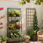
We’ve all experienced that moment when we step onto our patio or deck and feel something’s missing. The furniture’s there but the space lacks personality and warmth. That’s where outdoor pillows come in – they’re the secret weapon that transforms bland outdoor spaces into inviting retreats that rival any indoor living room.
The right color scheme can make or break your outdoor oasis. We’re not just talking about matching colors here – we’re talking about creating a mood that makes guests want to linger longer and transforms your backyard into the neighborhood’s go-to gathering spot. Whether you’re drawn to bold tropical hues that scream summer fun or prefer subtle earth tones that whisper sophistication outdoor pillows offer endless possibilities.
From coastal blues that capture ocean breezes to warm terracotta shades that embrace sunset vibes we’ll explore color combinations that’ll make your outdoor space absolutely irresistible. Let’s jump into the industry of outdoor pillow color schemes that’ll elevate your space from ordinary to extraordinary.
Monochromatic Outdoor Pillow Color Schemes for Minimalist Appeal
Monochromatic outdoor pillow arrangements create sophisticated spaces that emphasize texture and form over busy patterns. We’ve discovered that single color palettes bring instant elegance to any patio while maintaining visual cohesion.
All-White Pillows for Clean Modern Looks
White outdoor pillows establish the foundation for contemporary minimalist design. Mixing different textures like linen, canvas, and woven materials in crisp white creates visual interest without color distraction. Pairing oversized square pillows with smaller lumbar options in matching white tones builds dimensional layers.
Performance fabrics in bright white resist fading and staining while maintaining that fresh modern appearance. Combining solid white pillows with subtle white on white patterns like geometric prints or botanical motifs adds sophistication. Weather resistant white options from brands like Sunbrella maintain their pristine look through multiple seasons.
Varying Shades of Blue for Coastal Vibes
Blue monochromatic schemes transport outdoor spaces to seaside retreats instantly. Layering navy, powder blue, and sky blue pillows creates depth while maintaining coastal harmony. Mixing textured fabrics in different blue saturations prevents the arrangement from appearing flat or monotonous.
Ocean inspired blue palettes work exceptionally well with natural materials like teak and wicker furniture. Selecting pillows in marine blue, periwinkle, and deep teal provides rich tonal variation within the same color family. Weatherproof blue fabrics in solution dyed acrylics maintain color integrity against UV exposure and saltwater conditions.
Neutral Beige and Tan Combinations
Beige and tan outdoor pillow collections offer warmth while maintaining understated elegance. These earthier neutrals complement natural wood furniture and stone surfaces beautifully. Combining cream, mushroom, and camel colored pillows creates sophisticated layers without overwhelming smaller spaces.
Natural fiber textures in beige tones like jute and linen blends enhance the organic feel of monochromatic neutral schemes. Varying pillow sizes from large floor cushions to standard throw pillows in coordinating beige shades builds comfortable seating arrangements. These versatile neutral palettes serve as perfect backdrops for seasonal accent colors when desired.
Complementary Color Outdoor Pillow Ideas for Bold Contrast

Moving beyond the subtle sophistication of monochromatic schemes, complementary colors create ever-changing energy that transforms outdoor spaces into vibrant gathering areas. These opposing color wheel pairs generate visual excitement while maintaining balance through their natural harmony.
Orange and Blue Pillow Pairings
Orange and blue combinations deliver vibrant contrast that energizes coastal and modern patios alike. Blue cushions create stunning focal points when paired with orange accent pillows, bringing a lively yet balanced atmosphere to outdoor seating areas. Coastal patios benefit from this pairing’s natural connection to ocean and sunset themes, while modern spaces gain bold sophistication.
Pairing these colors with neutral furniture prevents overwhelming the space while allowing the pillows to shine as statement pieces. We recommend using varying shades of each color to create depth – think navy blue with burnt orange or sky blue with coral accents. This approach maintains the complementary relationship while adding nuanced layers to your outdoor design.
Red and Green Seasonal Combinations
Red and green pillows offer classic complementary contrast that extends beyond seasonal decorating into year-round outdoor style. These colors work exceptionally well with natural wooden furniture and lush garden surroundings, creating harmony between your seating area and industry. Seasonal applications make this pairing particularly festive during holidays, but softer or muted tones adapt beautifully for everyday use.
Varied patterns like florals or stripes enhance the warmth and visual interest of red and green combinations. Forest green pillows paired with burgundy accents create sophisticated outdoor rooms, while brighter emerald and cherry red combinations bring playful energy to casual patios. This color scheme particularly complements brick patios and natural stone elements.
Purple and Yellow Vibrant Accents
Purple and yellow combinations create rich, luxurious contrast that brightens outdoor spaces with unexpected sophistication. Yellow pillows serve as bold pops of color against deeper purple cushions, instantly elevating the visual impact of your seating arrangement. This pairing works particularly well in shaded areas where the bright yellow helps reflect available light.
Geometric or abstract patterns in these colors add modern flair while maintaining the complementary relationship’s natural balance. We suggest using varying intensities – pair deep eggplant purple with sunny yellow, or try lavender with golden yellow for a softer approach. This combination creates outdoor spaces that feel both energetic and refined, perfect for entertaining or relaxing in style.
Analogous Color Schemes for Harmonious Outdoor Spaces

Moving beyond bold contrasts, we discover that analogous color schemes create the most naturally pleasing outdoor pillow arrangements. These neighboring colors on the color wheel work together effortlessly, producing sophisticated spaces that feel both cohesive and visually soothing.
Blue-Green-Teal Oceanic Themes
Oceanic palettes transport your outdoor space into a tranquil coastal retreat. We love how this blue-green-teal combination evokes the calming essence of seaside living, making it perfect for poolside lounges or waterfront patios. Cool tones in these shades create a refreshing atmosphere that naturally complements wooden furniture bases and neutral outdoor settings.
Blending these oceanic hues enhances any space with lush garden greenery. Teal pillows serve as excellent anchor pieces, while lighter blues and deeper greens add dimensional depth. Water features become even more striking when surrounded by these harmonious tones, creating a cohesive design that feels both sophisticated and relaxing.
Mixing textures within this color family amplifies the coastal vibe. Consider pairing smooth teal silk with textured blue linen and woven green outdoor fabrics. This approach maintains color harmony while adding tactile interest that invites guests to settle in comfortably.
Red-Orange-Yellow Sunset Inspired Palettes
Sunset palettes bring warmth and energy to social outdoor spaces. These vibrant analogous colors create an inviting atmosphere that’s ideal for entertaining on patios and decks. We find that red-orange-yellow combinations naturally encourage gathering and conversation, making them perfect for dining areas and fire pit zones.
Warm tones in this palette complement natural materials beautifully. Terracotta planters, olive green foliage, and cream colored furniture create stunning backdrops for these fiery pillow combinations. Orange serves as the perfect bridge between bold reds and cheerful yellows, maintaining visual flow throughout your seating arrangement.
Varying intensities within sunset colors prevents overwhelming your space. Deep burgundy reds paired with soft peach and golden yellow create sophisticated depth. This approach allows you to incorporate bold warmth while maintaining an elegant, curated appearance that works from morning coffee to evening cocktails.
Green-Blue-Purple Garden Fresh Combinations
Garden inspired color schemes reflect nature’s own floral diversity. This fresh analogous trio captures the essence of blooming gardens, offering endless possibilities for creating naturally beautiful outdoor spaces. Purple accents add unexpected sophistication to traditional green and blue outdoor color palettes.
Varying shades within this combination enhances your garden’s existing beauty. Sage green pillows blend seamlessly with outdoor foliage, while periwinkle blue adds gentle contrast without competing with natural surroundings. Deep purple accents create focal points that draw the eye and add luxurious depth to seating areas.
Patterned pillows work exceptionally well within this harmonious palette. Floral prints, geometric designs, and abstract patterns all maintain cohesion when they stay within the green-blue-purple family. We recommend mixing different patterns while keeping consistent color relationships to achieve maximum visual interest without sacrificing harmony.
Triadic Color Outdoor Pillow Arrangements for Balanced Design

Triadic color schemes take your outdoor pillow design to the next level by using three colors positioned equidistantly on the color wheel. We’ll explore how these vibrant yet harmonious combinations create perfect balance while adding ever-changing visual interest to your outdoor spaces.
Red, Blue, and Yellow Primary Combinations
Primary triadic combinations deliver bold energy that transforms any outdoor seating area into a cheerful gathering space. Bright red pillows serve as striking focal points when paired with blue and yellow accent cushions, creating the perfect backdrop for entertaining guests. We recommend starting with one dominant color and using the other two as supporting accents to maintain visual balance.
Position these vivid hues strategically across your seating arrangement to distribute the visual weight evenly. Solid colored pillows work exceptionally well in this scheme, though you can mix in patterns that incorporate two or more of these primary colors for added depth.
Orange, Green, and Purple Secondary Schemes
Secondary triadic colors offer sophisticated richness that appeals to those seeking vibrant yet refined outdoor aesthetics. Green pillows naturally complement garden and patio settings, while orange and purple accents add warmth and luxury to the overall design. These combinations work particularly well in natural wood furniture arrangements where the colors enhance rather than compete with organic materials.
Mix different textures within this color palette to create visual interest without overwhelming the space. Weather resistant fabrics in these saturated tones maintain their vibrancy longer, ensuring your investment continues to enhance your outdoor living areas season after season.
Soft Pastels in Triadic Harmony
Pastel triadic schemes provide gentle elegance perfect for creating serene outdoor retreats focused on relaxation. Pastel pink, mint green, and soft lavender pillows work together to establish a fresh, light atmosphere that feels both calming and sophisticated. We find these softer tones particularly effective in covered patios and garden nooks where subtle beauty takes precedence over bold statements.
Layer different shades within each pastel family to add depth while maintaining the peaceful aesthetic. These gentle color combinations photograph beautifully and create Instagram worthy outdoor spaces that feel both current and timeless.
Seasonal Color Schemes for Year-Round Outdoor Pillow Updates

Refreshing your outdoor space with seasonal pillow colors transforms patios throughout the year. We’ll explore how strategic color updates create distinct seasonal moods while maintaining style continuity.
Spring Fresh Greens and Soft Pinks
Spring awakens our outdoor spaces with mint greens, soft pinks, and light yellows that capture nature’s renewal. These soft pastels create an airy, fresh atmosphere that perfectly complements blooming gardens and emerging foliage. We recommend pairing mint green pillows with blush pink accents to evoke the gentle awakening of spring gardens.
Cotton and linen fabrics work exceptionally well for spring pillow updates due to their breathability and comfort. Floral patterns enhance the seasonal theme while adding visual interest without overwhelming the space. Light yellow accents brighten darker outdoor furniture and create cheerful conversation areas for spring entertaining.
Summer Bright Corals and Turquoise
Summer calls for energetic hues that reflect the season’s vibrant energy and extended daylight hours. Bright corals paired with turquoise create stunning focal points that energize poolside lounges and sunny patios. Bold reds and sunny yellows amplify the cheerful summer atmosphere while maintaining sophisticated appeal.
Canvas and microfiber fabrics resist sun damage and moisture, making them ideal for summer’s harsh conditions. Striped patterns add ever-changing movement without creating visual chaos, while geometric designs complement modern outdoor furniture. We suggest mixing three vibrant colors maximum to maintain balance in bright summer arrangements.
Fall Warm Oranges and Deep Reds
Autumn transforms outdoor spaces with warm oranges, deep reds, and rich browns that mirror changing leaves. These earthy tones create cozy gathering spaces perfect for cooler evening conversations and harvest season entertaining. Deep burgundy pillows paired with burnt orange accents capture fall’s sophisticated warmth.
Velvet and chenille textures add tactile richness that complements autumn’s desire for comfort and warmth. Rich brown pillows anchor fall arrangements while allowing orange and red accents to pop against neutral furniture. We recommend incorporating golden yellow touches to brighten the palette and prevent it from becoming too heavy.
Winter Cool Blues and Crisp Whites
Winter palettes embrace cool blues and crisp whites that create tranquil outdoor retreats even in colder months. These calming shades evoke fresh snow and clear winter skies while maintaining elegance in covered outdoor areas. Navy blue anchors winter arrangements while lighter blues add depth and visual interest.
Wool and fleece materials provide warmth and comfort for winter outdoor use while maintaining weather resistance. Crisp white pillows create clean contrast against darker furniture and allow blue accents to shine. We suggest adding silver or gray touches to enhance the winter palette’s sophisticated coolness without sacrificing warmth.
Nature-Inspired Outdoor Pillow Color Palettes

Building on seasonal approaches, we can draw inspiration directly from nature’s own color combinations to create outdoor spaces that feel authentically connected to the environment. These palettes echo the outdoors while maintaining sophisticated design principles that work across modern to rustic decor styles.
Earth Tone Combinations with Browns and Greens
Earth tone schemes bring the grounding warmth of soil, wood, and foliage into our outdoor spaces through carefully selected browns, beiges, tans, and greens. Mixing various shades of brown with olive greens creates depth while maintaining natural harmony that complements surrounding plants and trees. Textural elements like faux jute or natural fiber pillows soften these earth tones and add tactile interest to seating areas.
Olive greens paired with cream or white offer fresh contrast while preserving the natural aesthetic we’re cultivating. Combining green and white patterns with black accents creates visual structure without overwhelming the organic feel. Tan and white combinations provide versatile foundations that work beautifully with wooden furniture and natural stone elements commonly found in outdoor settings.
Sunset Schemes with Warm Oranges and Pinks
Warm sunset inspired palettes capture the vibrant glow of evening skies through bold oranges, pinks, and complementary reds or yellows. These colors add inviting warmth to patios and decks while creating focal points that draw people into outdoor dining and lounging areas. Floral and tropical motifs work particularly well with these sunset hues, improving the connection to nature’s daily spectacle.
Vibrant oranges paired with soft pinks create uplifting atmospheres perfect for entertaining and social gatherings. Layering different intensities within the sunset palette prevents overwhelming brightness while maintaining the cozy warmth we associate with golden hour. Adding cream or neutral backgrounds allows these warm tones to shine without competing for attention.
Ocean-Inspired Blues and Aqua Tones
Blue and aqua tones reflect the calming influence of sea and sky, bringing refreshing tranquility to outdoor living spaces through shades ranging from deep navy to soft teal. These ocean inspired colors work exceptionally well in coastal themed or tropical outdoor decor where they enhance the connection to water elements. Combining blues with sage and forest greens creates layered looks that incorporate both water and flora influences.
Various blue grays mixed with greenish blues replicate the natural textures of moving water and coastal vegetation. Deep navy anchors lighter aqua tones while preventing the palette from feeling too ethereal for substantial outdoor furniture. Pale aqua accents brighten shaded areas while maintaining the serene quality that makes ocean colors so appealing for relaxation spaces.


Last update on 2026-02-28 / Affiliate links / Images from Amazon Product Advertising API
Bold and Bright Outdoor Pillow Color Ideas for Statement Pieces

Moving beyond nature-inspired palettes, we can create dramatic outdoor spaces with statement colors that command attention. Bold and bright outdoor pillow schemes transform ordinary patios into ever-changing entertainment areas that reflect confidence and style.
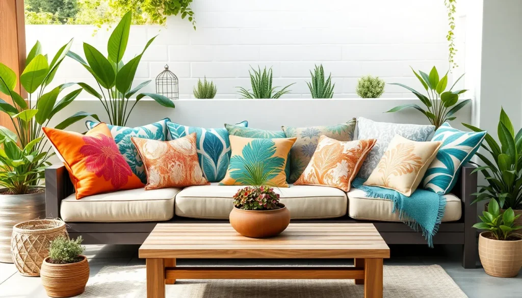
Tropical Vibrant Color Combinations
Create an instant vacation vibe with tropical color combinations that energize your outdoor space through playful, bright mixes. Teal and coral partnerships deliver the most striking tropical impact, especially when enhanced with sunny yellow accents through lanterns or planters. Mixing these vibrant hues requires following the 60-30-10 rule: choose teal as your dominant color (60%), coral as your secondary shade (30%), and yellow as your accent pop (10%).
Layer tropical patterns like large leaf prints or bold florals to reinforce the beach-inspired theme while maintaining visual harmony. Boho outdoor areas particularly benefit from these lively combinations, as they highlight the fun, relaxed mood perfect for entertaining. Balancing these intense colors with natural surroundings prevents overwhelming the space while still achieving that coveted resort atmosphere.
Jewel Tone Pillow Arrangements
Elevate your outdoor space with sophisticated jewel tones like deep navy, emerald green, and rich burgundy that create luxurious, high-end aesthetics. Navy cushions paired with gold metallic accents through lanterns or side tables deliver contemporary elegance that rivals indoor sophistication. Emerald green pillows complement natural wood furniture beautifully, creating depth while maintaining that polished, upscale appearance.
Balance jewel tones with white elements such as throws or area rugs to prevent the space from feeling too heavy or dark. Rich burgundy works exceptionally well in fall and winter settings, providing warmth while maintaining that refined, expensive look. Mixing different jewel tones together creates visual interest, but keeping one color dominant ensures the arrangement remains cohesive rather than chaotic.
High-Contrast Black and White Schemes
Achieve timeless sophistication with black and white pillow schemes that provide clean-lined appeal and versatile styling options. Starting with black metal or dark wicker furniture creates the perfect foundation for crisp white cushions that bring balance and brightness to the arrangement. Gray textural elements like woven throws or patterned rugs add necessary depth without compromising the scheme’s elegant simplicity.
Adapt this classic palette to both minimalistic modern patios and eclectic mixed-pattern designs by varying the proportions and textures. Geometric black and white patterns work particularly well for contemporary spaces, while softer textures in these colors suit traditional or transitional outdoor areas. Striped patterns in black and white create visual movement and interest while maintaining the scheme’s sophisticated, hotel-like atmosphere.
Neutral Outdoor Pillow Color Schemes for Versatile Styling

Neutral outdoor pillows offer the ultimate foundation for outdoor decorating, providing timeless elegance that adapts to any seasonal update or style preference. We’ll explore how these sophisticated color palettes create cohesive outdoor environments that complement both natural surroundings and diverse furniture styles.
Warm Neutrals with Cream and Taupe
Cream and taupe outdoor pillows bring cozy warmth to patios while maintaining sophisticated appeal throughout the seasons. These earthy tones create inviting spaces that naturally complement wooden furniture, teak dining sets, and natural fiber rugs. Pillows in cream shades with subtle texture variations add depth without overwhelming your existing decor, making them perfect base colors for layering seasonal accents.
Taupe pillows offer slightly more grounding than cream options, providing rich undertones that harmonize beautifully with earth tone landscaping. We recommend mixing solid cream pillows with textured taupe options to create visual interest while maintaining color harmony. These warm neutrals work exceptionally well in covered patios and pergola areas where you want to enhance the natural wood elements.
Cool Neutrals with Gray and White
Gray and white outdoor pillow combinations deliver fresh, contemporary aesthetics that enhance modern patio designs and minimalist outdoor furniture. Soft gray pillows create sophisticated backdrops for white accent pieces, while varying gray tones from light silver to charcoal add dimensional layering. These cool neutrals complement metal furniture, wicker seating, and stone fire pit areas with effortless elegance.
White outdoor pillows provide clean foundations that brighten shaded outdoor spaces and create striking contrasts against dark furniture pieces. Mixing different white textures like cotton, canvas, and microfiber creates visual depth while maintaining the crisp, modern appearance. Cool neutral schemes work particularly well in contemporary outdoor settings where clean lines and uncluttered aesthetics take priority.
Mixed Neutral Tones for Flexible Decorating
Mixed neutral outdoor pillow arrangements combine cream, taupe, gray, and off white shades to create sophisticated color palettes with maximum decorating flexibility. This approach allows you to layer different textures and subtle patterns like stripes or botanical prints without disrupting overall color harmony. We find that combining three to four neutral tones creates optimal visual interest while maintaining the understated elegance that neutral schemes provide.
Flexible neutral combinations adapt seamlessly to seasonal decorating changes, serving as perfect foundations for adding bright accent pillows during summer or rich jewel tones during fall. These mixed neutral arrangements work across diverse outdoor styles from modern farmhouse to minimalist contemporary, making them ideal investments for long term outdoor decorating. Pottery Barn and similar retailers offer extensive neutral collections that include both solid and patterned options, giving you many ways to customize your mixed neutral palette.
Conclusion
We’ve explored countless ways to transform your outdoor space through thoughtful pillow color schemes. From monochromatic elegance to bold triadic combinations each approach offers unique opportunities to express your style while creating comfortable gathering spaces.
The key to success lies in understanding how different color relationships work together. Whether you’re drawn to nature-inspired earth tones or vibrant tropical hues the right pillow colors can completely reimagine your patio’s atmosphere.
Remember that outdoor pillows aren’t just decorative elements—they’re investment pieces that define your space’s personality. By choosing colors that reflect both your taste and the seasons you’ll create an outdoor retreat that feels intentional and welcoming year-round.
Start with one color scheme that speaks to you and let your creativity guide the rest of your outdoor design journey.
Frequently Asked Questions
What are the most popular outdoor pillow color schemes?
The most popular outdoor pillow color schemes include monochromatic designs (all-white or varying blues), complementary combinations (orange and blue, red and green), and neutral palettes (cream, taupe, gray). These schemes offer versatility and visual appeal while complementing various outdoor furniture styles and architectural elements.
How do I choose colors for seasonal outdoor pillow changes?
For spring, use fresh greens and soft pinks; summer calls for bright corals and turquoise; fall benefits from warm oranges and deep reds; winter works well with cool blues and crisp whites. Consider fabric durability and weather resistance when selecting seasonal colors and materials.
What are triadic color schemes for outdoor pillows?
Triadic color schemes use three colors positioned equally on the color wheel. Popular combinations include primary triads (red, blue, yellow), secondary triads (orange, green, purple), and soft pastel triads (pink, mint green, lavender). These create balanced, visually interesting designs for patios.
Can I mix different pillow textures with the same color scheme?
Yes, mixing textures within the same color scheme adds depth and visual interest. For example, combine smooth cotton, textured linen, and plush velvet pillows in similar blues or neutrals. This technique works especially well with monochromatic color schemes.
What neutral colors work best for outdoor pillows?
The best neutral colors for outdoor pillows include warm neutrals like cream, beige, and taupe for cozy atmospheres, and cool neutrals like gray and white for modern aesthetics. Mixed neutral tones offer the most flexibility for seasonal updates and styling changes.
How do complementary colors enhance outdoor spaces?
Complementary colors like orange and blue or red and green create vibrant focal points that energize outdoor spaces. These high-contrast combinations work best when balanced with neutral furniture and accessories to prevent overwhelming the space while maintaining visual impact.
What colors create a coastal vibe for outdoor areas?
Coastal vibes are created using ocean-inspired colors like various shades of blue, aqua, teal, and white. Layer different blue tones from navy to sky blue, and incorporate sea glass greens and sandy beiges to enhance the coastal aesthetic.
Are bold colors suitable for outdoor pillows?
Bold colors like tropical teals, bright corals, and jewel tones work excellently for outdoor pillows. They create statement pieces and transform ordinary patios into vibrant entertainment areas. Balance bold colors with neutral elements to maintain sophisticated design principles.