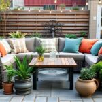
When it comes to transforming our home’s exterior, nothing makes a more dramatic impact than choosing the perfect paint colors for our outdoor walls. The right exterior color scheme doesn’t just boost curb appeal – it reflects our personality and creates a welcoming atmosphere that neighbors and guests will admire.
We’ve all walked past houses that made us stop and stare, wondering what made them so captivating. The secret often lies in bold color choices that complement the architecture while standing out from the typical beige and white facades that dominate many neighborhoods.
Whether we’re planning a complete exterior makeover or simply refreshing tired-looking walls, selecting the ideal outdoor paint colors can feel overwhelming with endless options available. From vibrant accent walls to sophisticated two-tone combinations, the possibilities are limitless when we know which colors work best for different architectural styles and lighting conditions.
Bold and Beautiful: Vibrant Exterior Color Schemes That Make a Statement
Making a dramatic impact with your home’s exterior starts with choosing colors that command attention and express confidence.
Fire Engine Red for Maximum Curb Appeal
Fire engine red creates an undeniably powerful first impression that transforms any home into a neighborhood focal point. We’ve seen this bold exterior color work exceptionally well on Victorian houses, farmhouses, and contemporary designs where architectural details deserve highlighting.
Best practices for fire engine red exteriors:
Pair red with crisp white trim to create classic contrast that prevents overwhelming the eye
Choose complementary accent colors like charcoal gray or deep navy for shutters and doors
Consider your home’s architectural style since red works beautifully with both traditional and modern designs
Test the color in different lighting conditions as red can appear dramatically different in morning versus evening light
Red exterior walls require careful color balancing with surrounding industry elements. We recommend incorporating white or cream colored outdoor furniture and neutral hardscaping materials like gray stone or natural wood to ground the vibrant color choice.
Sunshine Yellow to Brighten Your Home’s Facade
Sunshine yellow brings warmth and cheerfulness to any home exterior while creating an inviting atmosphere that welcomes guests. We’ve found that yellow works particularly well in areas with abundant natural greenery since it complements foliage beautifully.
Effective yellow exterior color applications:
Select warm undertones like golden yellow or butter yellow rather than cool lemon tones
Combine yellow with white trim and black shutters for a timeless colonial look
Incorporate natural wood accents through porch railings or window boxes to enhance the organic feel
Balance the brightness with darker foundation colors or stone wainscoting for visual grounding
Yellow exterior paint reflects sunlight effectively, making homes appear larger and more prominent in their settings. We suggest using this color strategically on homes with interesting architectural features like bay windows, wraparound porches, or decorative trim work.
Ocean Blue for Coastal-Inspired Elegance
Ocean blue exterior colors evoke tranquility and sophistication while creating a timeless appeal that works in various geographic locations. We’ve observed that blue exteriors maintain their visual impact across different seasons and lighting conditions.
Strategic ocean blue color implementation:
Choose deeper navy blues for larger homes and lighter coastal blues for smaller structures
Accent with white trim and natural wood elements like cedar shingles or driftwood gray details
Coordinate with industry elements including white gravel pathways or sandy colored hardscaping
Layer different blue tones through shutters, doors, and architectural trim for added depth
Blue exterior walls pair exceptionally well with metal roofing in copper or slate gray finishes. We recommend incorporating coastal inspired elements like rope details, nautical hardware, or weathered wood accents to complete the sophisticated ocean blue exterior color scheme.
Classic and Timeless: Traditional Exterior Paint Color Combinations

While bold exterior colors make striking statements, classic combinations offer enduring appeal that transcends seasonal trends. These time-tested palettes provide sophisticated elegance while maintaining broad market appeal for your home’s exterior.
Crisp White with Black Trim for Timeless Sophistication
Crisp white paired with black accents creates the most enduring exterior color combination in home design. This classic pairing features bright, clean white as your primary wall color with black window trims, shutters, and front doors providing dramatic contrast. The combination delivers striking elegance that suits both traditional and farmhouse architectural styles without overwhelming your home’s natural features.
Black accents add essential depth and architectural interest to white exteriors. These dark elements include door frames, porch railings, and decorative shutters that highlight your home’s structural details. The high contrast between white walls and black trim creates visual definition that enhances curb appeal across all seasons and lighting conditions.
Sophisticated appeal emerges from this combination’s ability to look both crisp and refined simultaneously. The pairing works exceptionally well with landscaping elements like dark green foliage or colorful flower beds that complement rather than compete with your exterior palette. This timeless approach ensures your home maintains its elegant appearance for decades without requiring frequent updates.
Warm Beige and Cream Tones for Universal Appeal
Warm beige shades provide universal appeal through their soft, inviting appearance that blends harmoniously with various surroundings. Carrington Beige, featuring subtle green undertones, exemplifies this versatile color family that creates cozy yet refined exterior aesthetics. These neutral tones work particularly well in neighborhoods with mixed architectural styles or natural settings with abundant trees and landscaping.
Cream trim combinations enhance beige exteriors through complementary neutral pairings. China White or Swiss Coffee trim colors create harmonious palettes that feel both sophisticated and approachable. The subtle contrast between beige walls and cream accents provides visual interest without the stark drama of high-contrast combinations.
Understated elegance defines this color approach, making it perfect for homeowners seeking broad appeal. The combination suits traditional homes while remaining neutral enough to accommodate changing industry colors throughout the seasons. This palette choice ensures your exterior maintains its welcoming appearance across different lighting conditions and weather patterns.
Sage Green with Natural Wood Accents
Sage green brings nature-inspired tranquility to exterior walls through its muted, organic charm. Louisburg Green represents this cool, mossy tone that evokes calm while maintaining sophisticated appeal. This earthy hue works beautifully as a primary body color that connects your home to its natural surroundings without appearing overwhelming or trendy.
Natural wood elements provide perfect complementary accents to sage green exteriors. Door frames, porch columns, and decorative trim in natural wood tones add warmth and texture that balances the cool undertones of green paint. These organic materials create visual interest while maintaining the nature-inspired aesthetic that makes sage green so appealing.
Balanced earthiness emerges when sage green pairs with neutral gray or cream accent colors. These secondary tones prevent the green from becoming too dominant while maintaining the overall organic feel of your exterior palette. The combination works exceptionally well with stone or brick architectural elements that reinforce the natural, timeless appeal of this color scheme.
Modern and Minimalist: Contemporary Outdoor Wall Painting Ideas

Contemporary outdoor walls embrace simplicity and clean lines to create striking visual impact. We’ll explore three essential approaches that define modern minimalist exterior design.
Charcoal Gray for Sleek Urban Style
Charcoal gray delivers sophisticated urban appeal that transforms any exterior into a contemporary masterpiece. This versatile color creates clean, modern facades when applied to siding or brick surfaces, offering a perfect backdrop for architectural details. We recommend pairing charcoal exteriors with natural wood elements or metal accents to introduce warmth and texture contrast.
Black trim, doors, and gutters complement charcoal walls beautifully, maintaining a cohesive color scheme that emphasizes geometric shapes. Designers favor this combination because it streamlines the overall appearance while highlighting clean lines and modern architectural features.
Pure White Monochromatic Schemes
Pure white monochromatic schemes represent the pinnacle of minimalist exterior design philosophy. This approach uses a single color family across walls, trims, and architectural details to achieve a bright, clean aesthetic that maximizes natural light reflection. White exteriors enhance spatial perception and create an illusion of larger outdoor areas.
Monochromatic white schemes emphasize sharp angles and geometric forms that reinforce minimalist principles of order and simplicity. We find this color choice particularly effective for highlighting unique architectural features and creating a timeless, sophisticated appearance that never goes out of style.
Black Accent Walls with Neutral Bases
Black accent walls paired with neutral bases like light gray or off-white create dramatic contrast while maintaining minimalist elegance. This technique adds depth and visual interest to outdoor spaces without overwhelming the calm, restrained palette that defines contemporary design. Black accents work exceptionally well to frame entryways, patios, or distinctive architectural features.
Neutral base colors provide the perfect foundation for bold black statements, creating focal points that define spaces and guide the eye. We often see this combination complemented by natural materials like stone or wood, which introduce organic textures while respecting the minimalist aesthetic principles.
Nature-Inspired: Earth Tone Exterior Color Palettes

Moving from modern minimalism to organic warmth, we discover how earth tone palettes create stunning outdoor wall designs that harmonize with natural surroundings. These nature-inspired colors draw directly from soil, stone, and foliage to establish a grounded aesthetic that never goes out of style.
Warm Terracotta and Clay Shades
Warm terracotta and clay tones transform exterior walls into welcoming, rustic showcases that reflect sunbaked earth and traditional pottery colors. Deep browns and muted oranges create character and warmth that makes any home feel inviting and grounded. We’ve seen these shades work exceptionally well when paired with golden yellow or citron green accents, balancing earth richness with lively energy.
Terracotta shades offer versatility in application, working beautifully on Mediterranean-style homes, southwestern architecture, and contemporary designs seeking organic appeal. Clay colors provide natural depth that changes beautifully throughout the day as sunlight shifts across the surface. These warm earth tones create an immediate sense of comfort and stability that welcomes both residents and visitors.
Forest Green for Blending with Industry
Forest green exterior colors create seamless integration between homes and their natural surroundings, especially in wooded or lush industry settings. Benjamin Moore’s Black Forest Green and Ashwood Moss exemplify how muted green tones with subtle black undertones provide dramatic yet cozy appeal. These sophisticated shades enhance curb appeal while maintaining an organic connection to the environment.
Deep forest greens work exceptionally well with natural materials like wood siding and stone accents, creating cohesive designs that feel intentionally connected to nature. Moss-inspired greens offer subtle variations that mimic the complex colors found in natural foliage throughout different seasons. We recommend these shades for homes situated among trees or in areas where natural industry integration is a priority.
Stone Gray to Mimic Natural Materials
Stone gray tones replicate the subtle textures and weathered beauty found in natural rock formations, offering neutral backdrops that complement both warm and cool color schemes. Benjamin Moore’s Gray Owl OC-52 and Silver Lake 1598 demonstrate how cool grays create elegant, understated exteriors that never overwhelm the architecture. These sophisticated neutrals pair beautifully with white trim or deeper accent colors for striking contrast.
Gray stone colors provide timeless appeal that works across various architectural styles, from modern farmhouse to contemporary designs. These shades offer the perfect balance between warmth and coolness, adapting to different lighting conditions throughout the day. Stone-inspired grays create lasting visual interest while maintaining the flexibility to update accent colors and landscaping over time.
Dramatic and Daring: High-Contrast Exterior Color Schemes

Moving beyond earth tones brings us to bold color combinations that make architectural statements. High contrast exterior schemes create striking visual impact through careful pairing of deep, rich colors with bright or metallic accents.
Navy Blue with Bright White Trim
Navy blue serves as an exceptional foundation color that transforms traditional and modern homes alike. This classic combination offers timeless appeal while creating sharp emphasis on architectural details through the stark contrast between dark walls and bright white trim.
Architectural features become dramatically highlighted when we apply this color scheme to homes with clean lines and defined moldings. Traditional colonial styles benefit from this pairing as the navy blue enhances the home’s formal character while the white trim draws attention to windows, doors, and decorative elements.
Modern homes gain sophistication through this bold contrast that emphasizes geometric shapes and structural elements. The deep blue creates a strong backdrop that makes white accents pop, resulting in a polished exterior that commands attention from the street.
Deep Purple with Metallic Accents
Deep purple creates an unconventional yet elegant statement that sets homes apart from typical color choices. This rich, dramatic color works exceptionally well as a body color when balanced with metallic accents on trim or architectural details.
Metallic finishes on trim pieces add touches of modern luxury that complement the purple base without overwhelming the overall design. Bronze, copper, or silver accents create different moods while maintaining the sophisticated character that deep purple brings to exterior walls.
Homeowners seeking daring yet refined exteriors find this combination particularly appealing as it balances boldness with elegance. The purple provides depth and richness while metallic elements introduce contemporary sophistication that works well with both traditional and modern architectural styles.
Burgundy with Cream Highlighting
Burgundy delivers a warm, inviting presence that creates rich visual depth on exterior walls. This deep red tone paired with cream highlights produces a sophisticated palette that works particularly well on craftsman and classic style homes.
Cream accents soften the intensity of burgundy while providing necessary contrast that prevents the exterior from appearing too dark or overwhelming. This highlighting technique works beautifully on trim, doors, and architectural details where the lighter color can define and enhance structural elements.
The combination results in an exterior that feels both welcoming and distinguished, with the warm burgundy creating an inviting atmosphere while cream details add brightness and visual interest. This pairing suits homeowners who want warmth and sophistication without the stark contrast of white trim options.
Regional and Climate-Specific: Outdoor Wall Colors for Different Environments

Geographic location and climate conditions significantly influence the best exterior paint choices for your home. We’ll explore how different environments require exact color palettes that enhance both beauty and durability.
Desert-Inspired Warm Neutrals
Desert exterior colors embrace the warm, earthy tones that naturally complement sunbaked landscapes. Sandy beige, terracotta, and muted sage greens create a harmonious blend with the surrounding terrain while providing practical cooling benefits. These colors reflect intense sunlight, helping maintain cooler home temperatures throughout scorching desert days.
Warm browns, taupes, and off-whites dominate successful desert palettes, mimicking the natural textures of adobe and desert sands. Sherwin-Williams offers excellent desert-style options like Maple View warm beige, Fossil muted gray, Weathered Saddle brown, and Vintage Ephemera off-white. Desert Modern architectural styles particularly benefit from these streamlined color choices that integrate seamlessly with natural landscapes.
Dusty reds and neutral grays round out the typical desert palette, creating sophisticated exteriors that work beautifully with desert plants and rock formations. Benefits extend beyond aesthetics, as these reflective colors help reduce cooling costs while maintaining visual appeal year-round.
Coastal Colors That Resist Salt Air
Coastal exterior palettes feature light, airy hues specifically formulated to withstand salty air and moisture challenges. Soft blues, seafoam greens, and crisp whites dominate these weather-resistant color schemes, evoking ocean and beach vibes while protecting your home’s exterior. Sandy neutrals and muted grays provide additional options that complement seaside environments beautifully.
Paint selection becomes crucial in coastal areas due to salt air’s corrosive effects on standard formulations. We recommend choosing paints specifically designed for marine environments, ensuring longer-lasting color retention and protection against humidity-related damage. Cool tones inspired by sea and sky naturally suit coastal settings while providing the durability needed for harsh weather conditions.
Weather resistance takes priority in coastal color selection, with manufacturers offering specialized formulations that resist fading and corrosion. These paints maintain their vibrant appearance even though constant exposure to salt spray and high humidity levels.
Mountain Home Earth Tones
Mountain homes benefit from earth tone palettes that create natural harmony with forest and rocky surroundings. Rich browns, deep greens, and warm grays mirror the colors found in trees, soil, and stone formations typical of mountainous terrain. Muted blues add subtle contrast while maintaining the organic feel essential for mountain architecture.
These natural color combinations help homes blend seamlessly into their environment, adapting beautifully to seasonal changes throughout the year. Deep forest greens work particularly well for homes nestled among evergreen trees, while rich browns complement wooden elements and natural stone features commonly found in mountain construction.
Seasonal adaptability makes earth tones ideal for mountain environments, as these colors remain attractive whether surrounded by spring greenery, autumn foliage, or winter snow. The natural palette ensures your home maintains its appeal across all seasons while honoring the rugged beauty of mountain landscapes.
| Environment | Color Characteristics | Typical Colors | Benefits |
|---|---|---|---|
| Desert | Warm neutrals, earthy | Sandy beige, terracotta, taupe, muted green, warm browns, off-white | Blends with desert industry, reflects sunlight, cooling |
| Coastal | Light, cool, weather-resistant | Soft blue, seafoam green, crisp white, sandy neutrals | Resists salt air corrosion, evokes ocean ambiance |
| Mountain | Earth tones, natural | Deep green, rich brown, warm gray, muted blue | Harmonizes with forest and rock, seasonal adaptability |
Trending and Popular: Current Exterior Paint Color Trends

We’re seeing a major shift in exterior color preferences as homeowners embrace warmer, more sophisticated palettes that reflect our connection to nature and desire for distinctive curb appeal.
Soft Pastels for Modern Farmhouse Style
Soft pastels dominate the modern farmhouse aesthetic with their gentle warmth and timeless appeal. Linen stands out as a top choice among these muted tones, offering a beige neutral that pairs beautifully with crisp white trim to create subtle yet striking contrast. This combination enhances detailed architectural features like board and batten siding, wraparound porches, and decorative shutters without overwhelming the home’s character.
We recommend using these pastels on large wall surfaces while keeping trim work in classic white or cream. The result creates a fresh, welcoming appearance that maintains the farmhouse style’s signature warmth. These colors work particularly well with natural materials like reclaimed wood accents and stone foundations.
Two-Tone Color Blocking Techniques
Two-tone exteriors create dramatic visual impact by using contrasting yet complementary colors on different sections of the home. Bold neutrals like deep beige or sophisticated gray serve as the primary color, while darker tones highlight architectural elements such as soffits, gutters, and corner strips.
This technique transforms ordinary facades into eye-catching showcases that emphasize structural details. We’ve seen stunning results when homeowners paint the main walls in warm gray and use charcoal or black for trim elements. The contrast creates clean lines that make the home appear larger and more architecturally interesting.
Color blocking works especially well on contemporary and transitional style homes where geometric shapes and clean lines already exist. The key lies in choosing colors that complement rather than compete with each other.
Jewel Tones for Sophisticated Appeal
Jewel tones bring elegance and depth to exterior walls through rich, saturated colors that make bold statements while harmonizing with natural surroundings. Deep blues evoke the sophistication of sapphires, creating stunning contrast when paired with white or cream trim.
Rich emerald greens offer another sophisticated option, particularly for homes nestled among mature trees and landscaping. These colors create seamless integration with natural elements while maintaining the dramatic presence that jewel tones provide.
We find that jewel tones work best on homes with strong architectural features that can handle the visual weight these colors carry. Victorian, Colonial, and Craftsman style homes particularly benefit from these sophisticated hues, as their detailed trim work and complex rooflines complement the richness of jewel toned walls.
Practical Considerations: Choosing Exterior Colors That Last

Selecting the perfect exterior paint involves more than aesthetic appeal. We must consider durability, weather resistance, and long-term maintenance to ensure our outdoor wall painting ideas deliver lasting results.
UV-Resistant Paint Options for Sun-Exposed Walls
UV-resistant formulations protect exterior walls from the damaging effects of prolonged sunlight exposure. These specialized paints contain UV inhibitors that prevent color fading and surface degradation, extending the life of your paint job significantly.
High-quality brands now offer exterior paints specifically designed with UV protection technology. These formulations maintain color vibrancy and surface integrity far longer than standard paints, making them essential for homes in sunny climates.
Investment in UV-resistant options pays dividends over time by reducing the frequency of repainting projects. We recommend choosing paints that explicitly list UV resistance on their labels, as this feature directly impacts the longevity of your exterior color scheme.
Climate-Appropriate Color Choices
Hot and sunny climates benefit most from lighter exterior colors that reflect sunlight rather than absorb it. Whites, light beiges, and pale greens help keep buildings cooler while showing minimal fading under intense UV exposure.
Cooler or cloudier environments allow for darker color choices that can actually improve comfort. Charcoal gray, forest green, and muted blues absorb more heat, making homes appear warmer while complementing lush green surroundings beautifully.
Regional weather patterns should guide your color selection process to ensure optimal performance. We’ve found that matching paint colors to local climate conditions significantly improves both aesthetic appeal and practical durability.
Maintenance-Friendly Exterior Paint Colors
Neutral and earthy tones offer the perfect balance between style and practicality for long-term maintenance. Colors like Revere Pewter, Carrington Beige, and Louisburg Green hide dirt effectively while showing minimal wear over time.
Strategic color combinations enhance both beauty and functionality by using contrasting elements wisely. White trim paired with darker main colors or bold front door accents help mask minor wear and tear between maintenance cycles.
Paint finish selection plays a crucial role in maintenance requirements across different surfaces. Semi-gloss or satin finishes work best for trims and accents because they resist dirt and clean easily, while matte finishes conceal surface imperfections on larger wall areas effectively.
Conclusion
We’ve explored countless possibilities for transforming your home’s exterior through strategic color choices. From bold statement hues to sophisticated minimalist palettes each approach offers unique benefits for improving curb appeal and personal expression.
The key lies in balancing your aesthetic vision with practical considerations like climate durability and maintenance requirements. Whether you’re drawn to nature-inspired earth tones or dramatic high-contrast schemes the right color combination will create a stunning exterior that reflects your style.
Your home’s exterior paint serves as more than decoration—it’s an investment in your property’s value and your daily satisfaction. With proper planning and quality materials your chosen palette will provide years of beauty while standing up to the elements.
Frequently Asked Questions
What are the most popular exterior paint colors right now?
Current trends favor warmer, sophisticated palettes that connect with nature. Soft pastels like linen with white trim are popular for modern farmhouse styles. Jewel tones such as deep blues and rich emerald greens are gaining popularity for their elegance and depth, especially on homes with strong architectural features.
How do I choose exterior colors that complement my home’s architectural style?
Consider your home’s design elements when selecting colors. Classic styles work well with timeless combinations like white and black trim. Modern homes suit bold contrasts or monochromatic schemes. Traditional homes benefit from warm earth tones, while contemporary designs can handle dramatic color blocking techniques.
What exterior paint colors work best in hot climates?
Light colors are ideal for hot climates as they reflect heat and keep homes cooler. Desert-inspired warm neutrals like sandy beige and terracotta harmonize with sunbaked landscapes while providing cooling benefits. Avoid dark colors that absorb heat and can cause discomfort and higher energy costs.
How can I create curb appeal with bold exterior paint choices?
Bold colors like fire engine red, sunshine yellow, or ocean blue can make a powerful statement. Balance vibrant colors with neutral trim and consider your neighborhood’s aesthetic. Use bold colors strategically on accent walls or architectural features rather than covering the entire exterior for maximum impact.
What are the best low-maintenance exterior paint colors?
Neutral and earthy tones like beige, sage green, and stone gray are excellent for hiding dirt and wear. These colors require less frequent touch-ups and maintain their appearance longer. Avoid pure white or very dark colors, which show dirt, scratches, and fading more readily.
Should I consider my geographic location when choosing exterior paint colors?
Absolutely. Coastal areas benefit from light, airy blues and seafoam greens that withstand salty air. Mountain homes look best in earth tones like rich browns and deep greens. Desert regions suit warm neutrals that complement the landscape while providing practical cooling benefits.
What paint finishes are best for exterior durability?
Semi-gloss or satin finishes are recommended for trims and accents as they’re easier to clean and more durable. For main surfaces, consider UV-resistant paints that protect against sun damage. Higher-quality finishes may cost more initially but save money on maintenance and repainting over time.
How do I use two-tone color schemes effectively on my home’s exterior?
Two-tone color blocking works best on contemporary designs with clean lines. Use contrasting colors on different architectural sections like the main body versus trim, or upper versus lower levels. Ensure colors complement each other and consider the home’s proportions to create balanced visual impact.